Ketna Patel: The philosopher’s palette
Though her eye-popping work has been sought by clients from Tata Motors to Spike Lee, Ketna Patel is more than a pop artist for hire. With a tri-cultural, outsider’s vision and virtual ‘travelling studios’ in India and Britain, she’s on a mission to wander the globe and pose life’s big questions.
)
Tell us about your background.
I grew up in Kenya in a unique tri-cultural community that was Indian, Kenyan and British. I have always been an ‘outsider’, restricted by cultural convention. That early repression has made me want to gobble up all sorts of 'otherness'.
I wanted to explore creativity, along with fundamental questions about who we are and where we are going as a human race.
You were an architect before you became an artist – what made you switch careers?
Whether one lives in a condominium in Panama, Singapore or Delhi, architecture has become diluted in a compromise between greedy developers and conveyor belt metropolitan lives. Everything looks more or less the same. I didn’t want to facilitate that, I wanted to explore creativity, along with fundamental questions about who we are and where we are going as a human race.
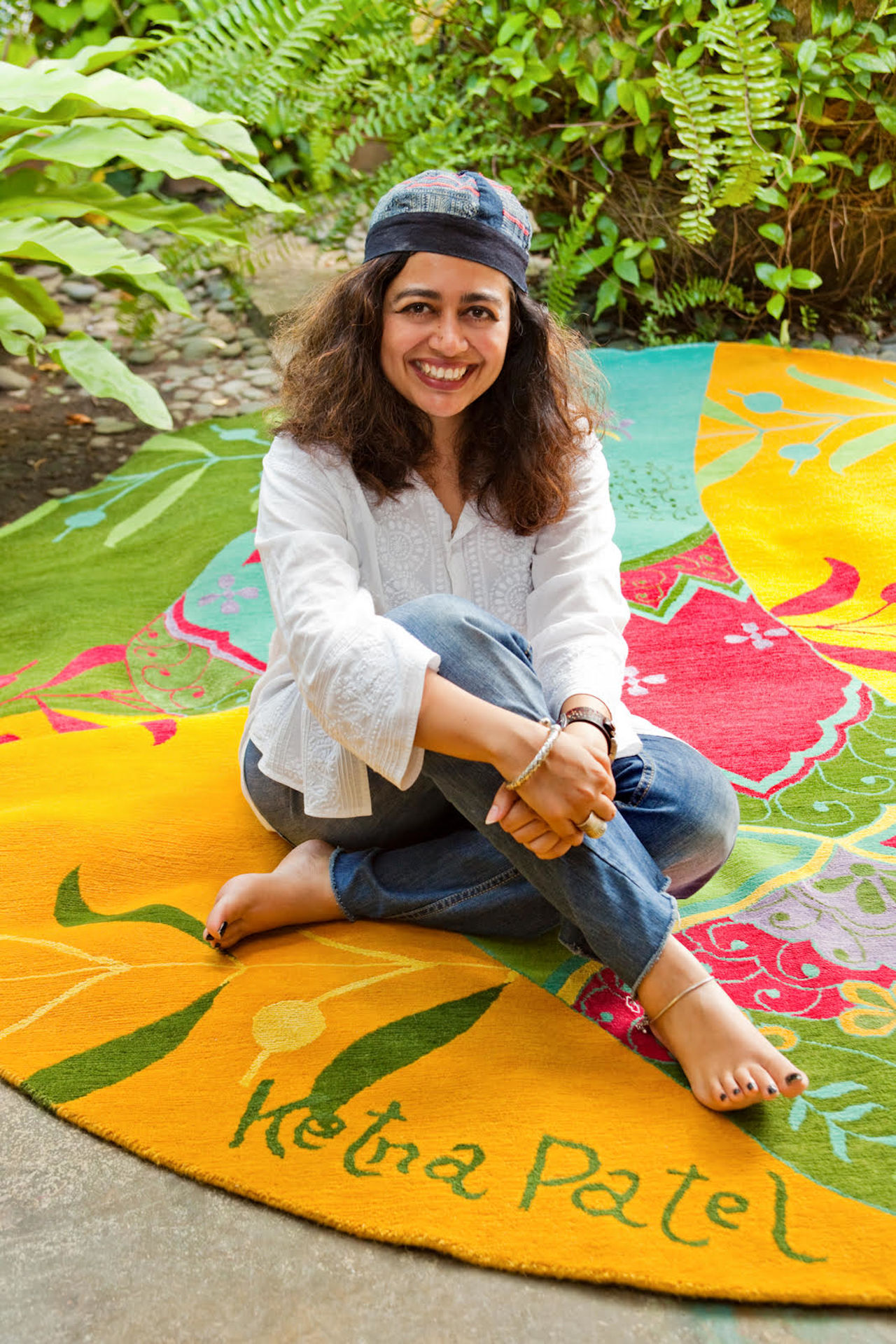
Above: Ketna Patel with her carpet design collaboration with The Orientalist, Singapore
Who or what have been the greatest influences on your art?
My inspiration has always been street culture. Spontaneous, uncelebrated tokens of self-expression are found everywhere in Africa and Asia – the truck artist, sign painter, weaver, craftsperson, chef, musician etc. These individuals don’t have the budgets for marketing campaigns, content testing or branding so they use whatever is around them. Over time, this has resulted in a unique blending of self-confidence, craft, design and 'hand-made-ness' that’s continually improved via feedback from the streets. These democratic, unselfconscious art expressions embody a powerful, authentic life energy.


Access the world's largest advertising database. With an intuitive toolset that helps you explore, present and collaborate more effectively.
Learn More
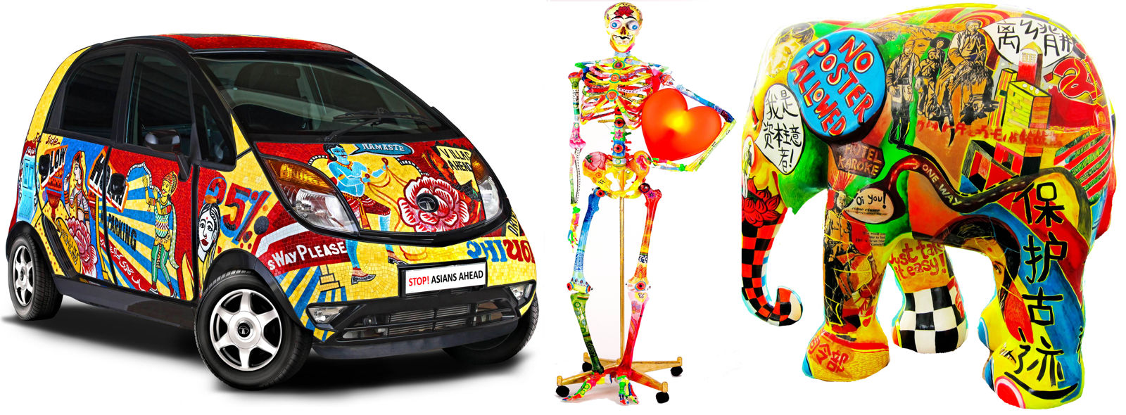

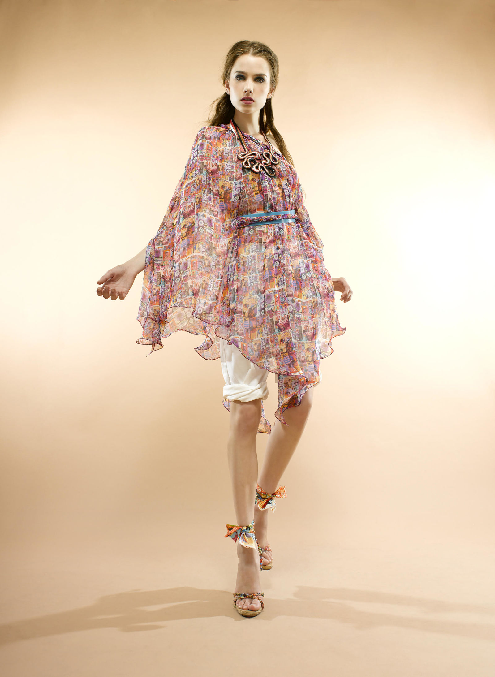
Above: Examples of alternative surfaces for art messaging; 'art-vertising' furniture; a fashion collaboration with All Dressed Up
Can you expand on your theory of art-vertising?
Art-vertising comes from the premise that our aesthetic sensibilities have been moulded by advertising far more than they have by fine art. For the past three generations, we have been bombarded by a plethora of images in the media that influence the way we express ourselves, decorate our homes and, ultimately, what we aspire to be. Art is increasingly becoming an appendage for the stage-sets of our lifestyles; a fashion accessory signalling to the world who we are and what we stand for.
I try and hack into this nebulous space by fusing my art compositions with printing and presentation techniques that belong to the advertising world. With digital printing, I can put my paintings on to cars, furniture, buildings, fashion… any surface you can think of! The idea is to move away from thinking of art as a framed canvas in a white cube gallery.
Western marketing has made the world clamour for lifestyles and objects that may not be compatible with their own culture.
We live in the information age, a unique moment in our civilisation, where the past, present and future are collapsing onto a singular plane, resulting in the ‘remix society’. I like to use various applications to host my ‘remix society’ message, so that we can have more fun with our complex identities instead of unconsciously encouraging homogenous uniformity.
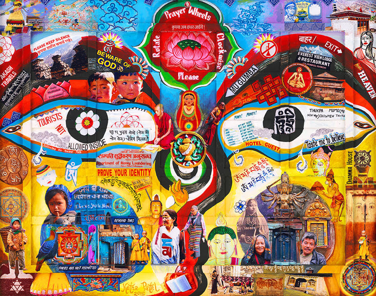
Above: Eyes On Tsum
How do you feel about Indian creatives in advertising try to ape western styles rather?
For centuries, Western narratives have dominated our education, style, culture and art. Now the West’s corporate-led, global propagation of information and aspirational brands needs a larger market to sustain itself. It’s no wonder that the Louvre is being exported to Abu Dhabi, or US university franchises are opening up in South Korea and Singapore, or that Chinese women spend their monthly earnings on a branded handbag!
Western marketing has made the world clamour for lifestyles and objects that may not be compatible with their own culture. Countries like India have not matured enough in unpacking their own frozen heritage and making it attractive for local consumption, because they haven’t made their homegrown narrative their own.

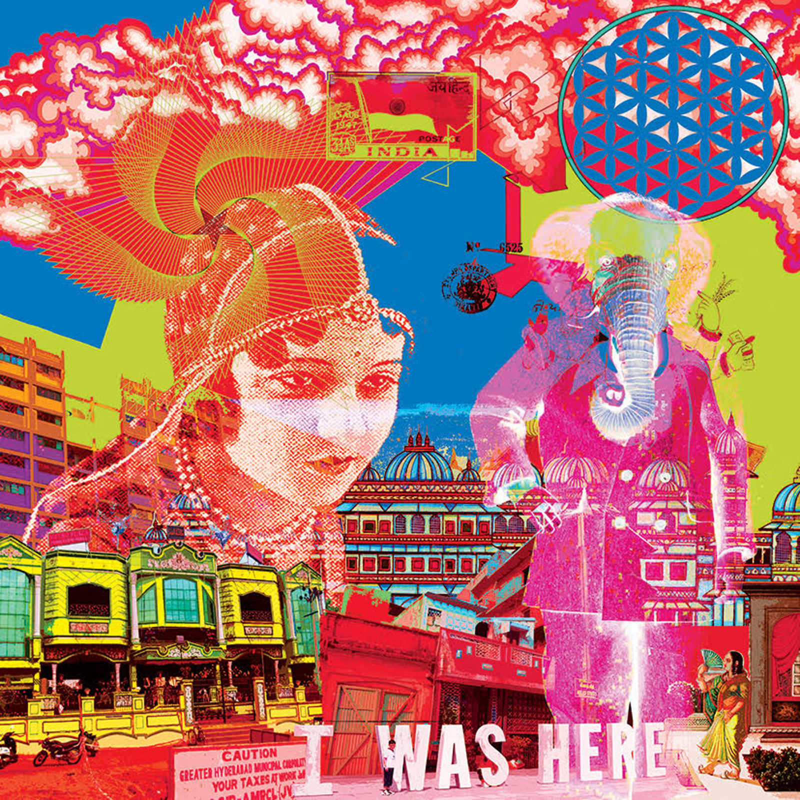

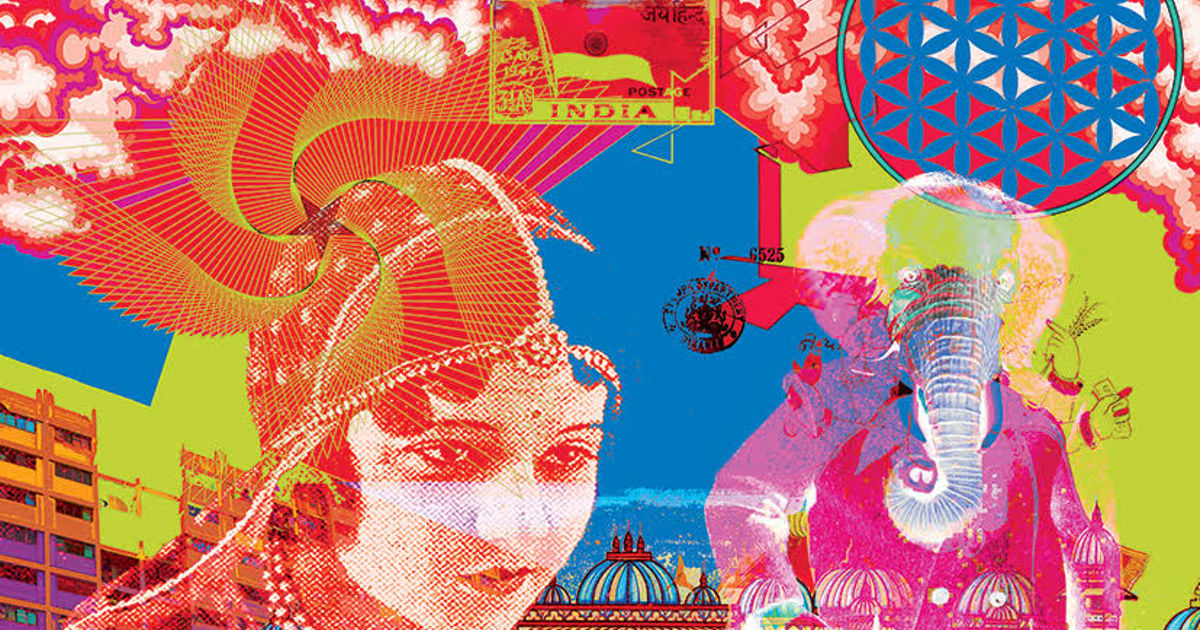
Above: The Creation; India I Was Here; The Flood
Can you quote any examples where Indian contemporary creativity, in advertising or other areas, has successfully merged Asian and Western styles?
Over the years there has been a percolation of Moghul, British, Zorasthian, Jewish and Christian influences that have become part of the everyday Indian vernacular. The spiritual bedrock of Hinduism is about acceptance and merging, and India is a country that lives off 'jugaad' or 'improvisation'. Whether it’s slums or five-star hotels, this cobbling together of contrasting narratives and methodologies gives myriad possibilities.
A splendid UK/India collaboration is the Taxi Fabric project [a collaboration between curator Sanket Avlani and W+K], in which clichéd depictions of India have been graphically deconstructed and retranslated into beautiful pop artworks that have upholstered the seats, ceiling and doors of taxis in Mumbai and Delhi. They look delicious and were featured in a Coldplay video – a brilliant example of how art and design in India can play a big part in rebranding postmodern India.

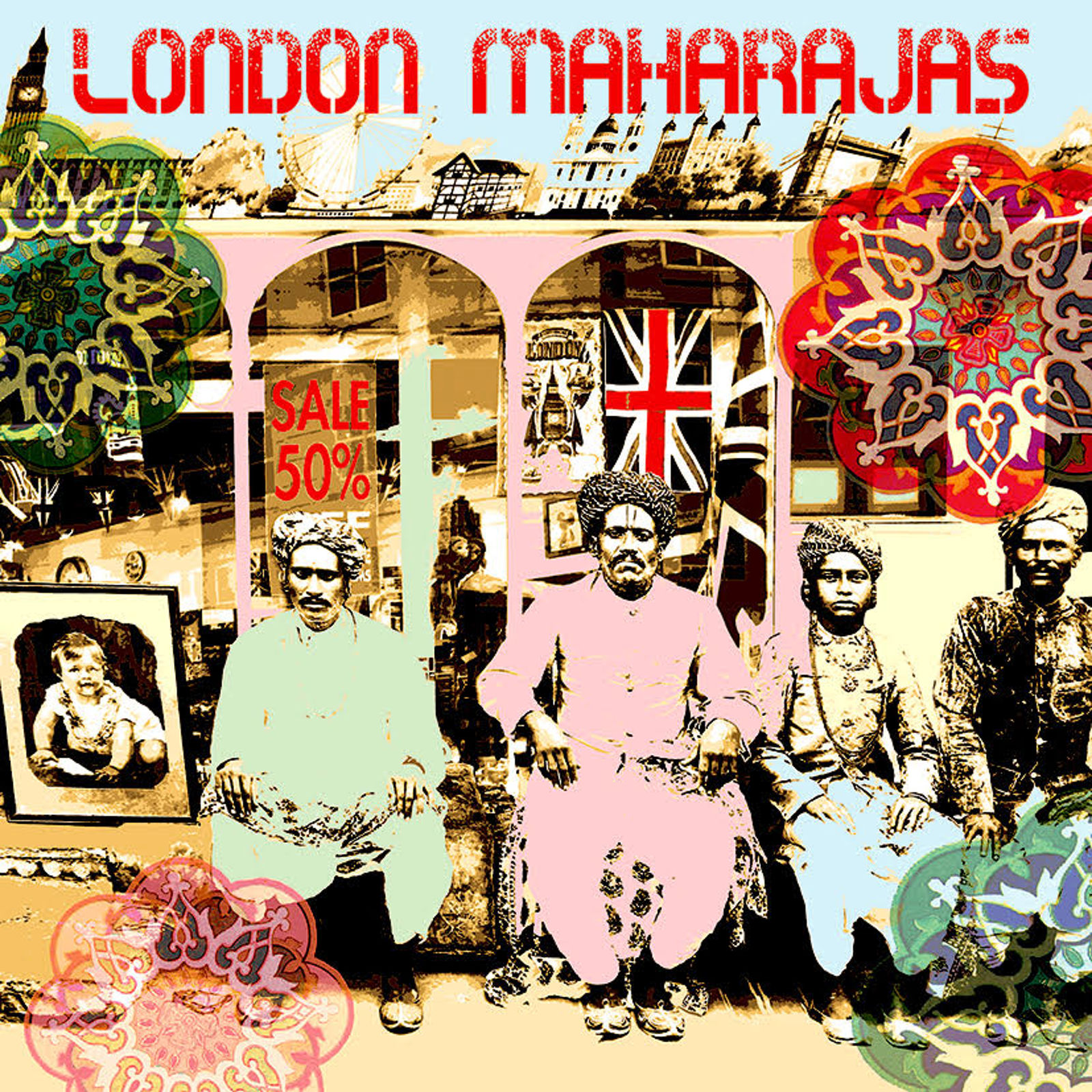
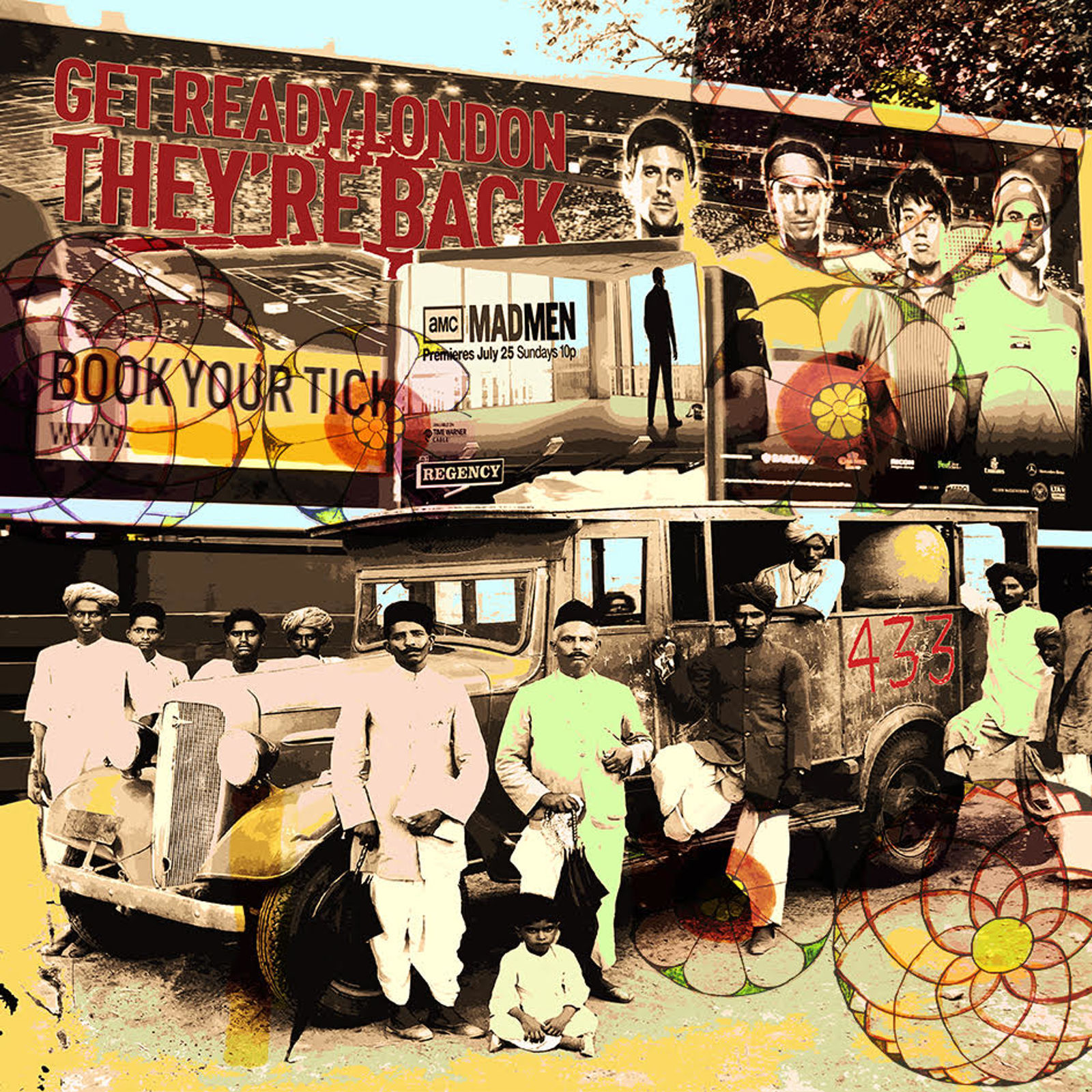

Above: Brexit UK; London Maharajas; Mad Men; Selling Britain By The Pound
You say you have ‘travelling’ studios in UK and India, how does that work?
However, a studio doesn’t have to be 'physical'. A long train journey, a rickshaw ride, a cup of tea with a Welsh granny… all these are 'travelling' studios, where each encounter becomes a layer to a collaged artwork in progress. Also, a computer that holds all the documented memories of countries travelled and lived in becomes an extension to these 'virtual' travelling studios, so making art in the Information world is entirely different from the days of Picasso and Van Gogh.
I reflect [Maya, the Hindu concept of illusion] in a lot of my work by deliberately using graphic techniques and colours that ape the super-saccharine, saturated, plastic perfect world of virtual media and advertising.
How does your work manifest the breakdown of cultural/national boundaries?
In the Asia Pop collection, my characters hail from different Asian countries. We have common histories, and our geopolitical boundaries are quite recent. If you look at our religion, architecture, cuisine, clothes, languages etc, these show that countries/cultures don’t exist in separate, sealed-off boxes.
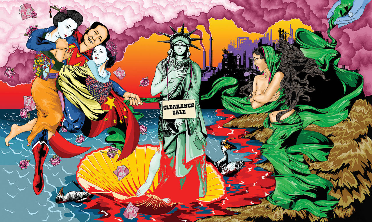
Above: The Fall Of Venus
When talking about your use of vivid colour you once said your artworks may appear ‘pretty’ but they have darkness lurking. Can you expand on that?
We live in the age of ‘Maya’, a Hindu concept of illusion. Aspirational messaging bombards us from everywhere, adding to our insecurity and increasing 'graspingness’. I reflect this in a lot of my work by deliberately using graphic techniques and colours that ape the super-saccharin, saturated, plastic perfect world of virtual media and advertising. In [Botticelli spoof] The Fall of Venus [above] I show the tug of war between today’s power symbols.
Chairman Mao dressed as Superman represents China's capitalistic-communist ethos. In this composition, China is trying to pull the saree off India (represented by Draupadi, a mythical Indian figure who is threatened with a humiliating public stripping). India / Draupadi has divine protection, represented by the blue hand of Krishna, who keeps replenishing her saree. The Statue of Liberty denotes the West and the torch of Freedom. The torch is unlit, and she is broken and in disarray. The shell that she is standing on represents the Petroleum company Shell’s logo.
In the background are oil refineries spewing out pollution, which appears as pretty pink clouds but is killing wildlife. Chinese money and roses fall from the sky, offering the viewer a choice of how to play the end game for humanity. Will it be the unsustainability of our current economic system, or nature and beauty that will win this contest?