How Golden Wolf sent Craig David on an ethereal ecological adventure
In a moving branded music video for Trainline, animators Ingi Erlingsson and Ewen Stenhouse were tasked with not only bringing David's music to life but also designing Mother Earth herself. shots caught up with the pair to find out how to address a topic as ominous as the climate crisis in a thoughtful, beautiful way.
)
With the ever-present threat of climate change looming, Trainline’s message to ditch the plane and travel by train has never felt so relevant. Their latest ambitious campaign aims to raise awareness of the environmental benefits of rail and encourage pride in choosing to travel by train.
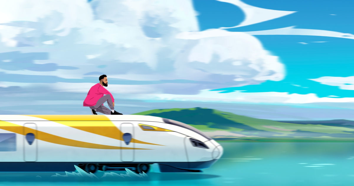
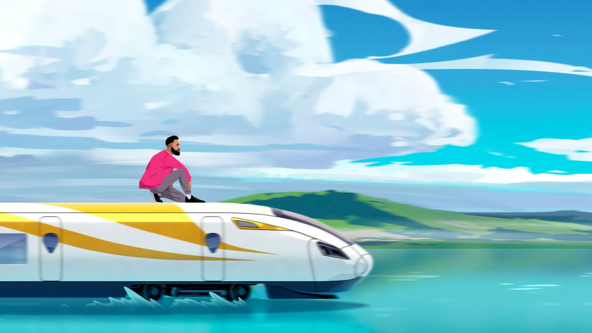
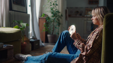
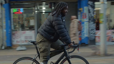
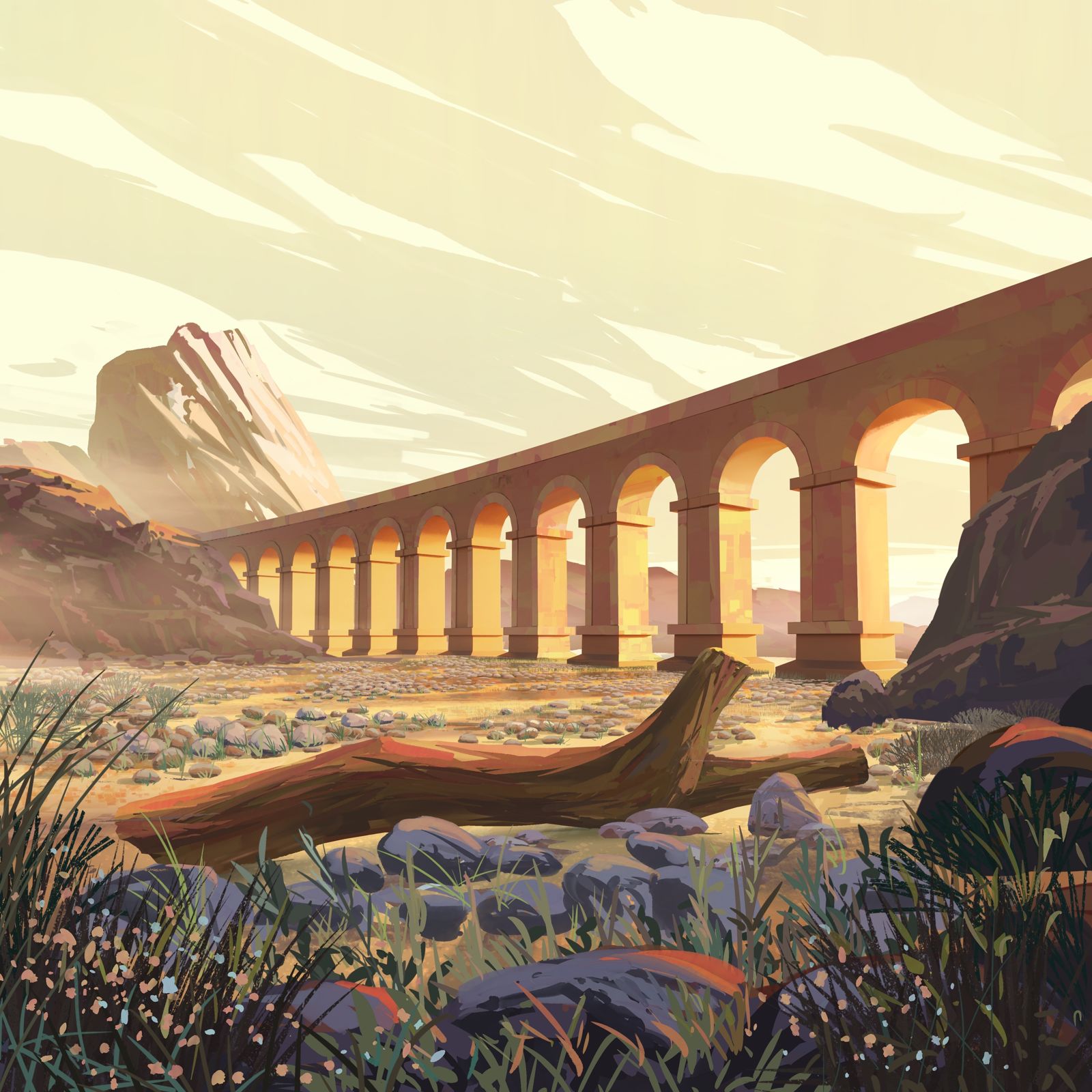
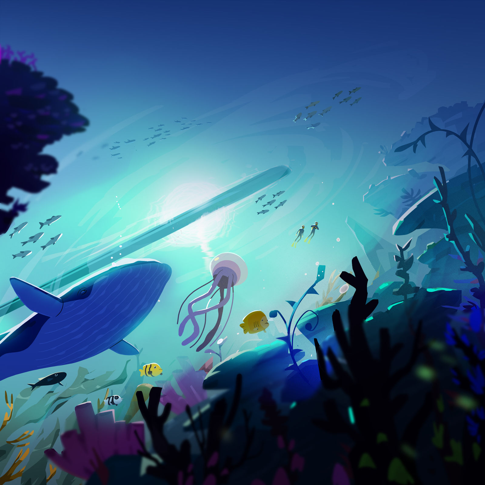
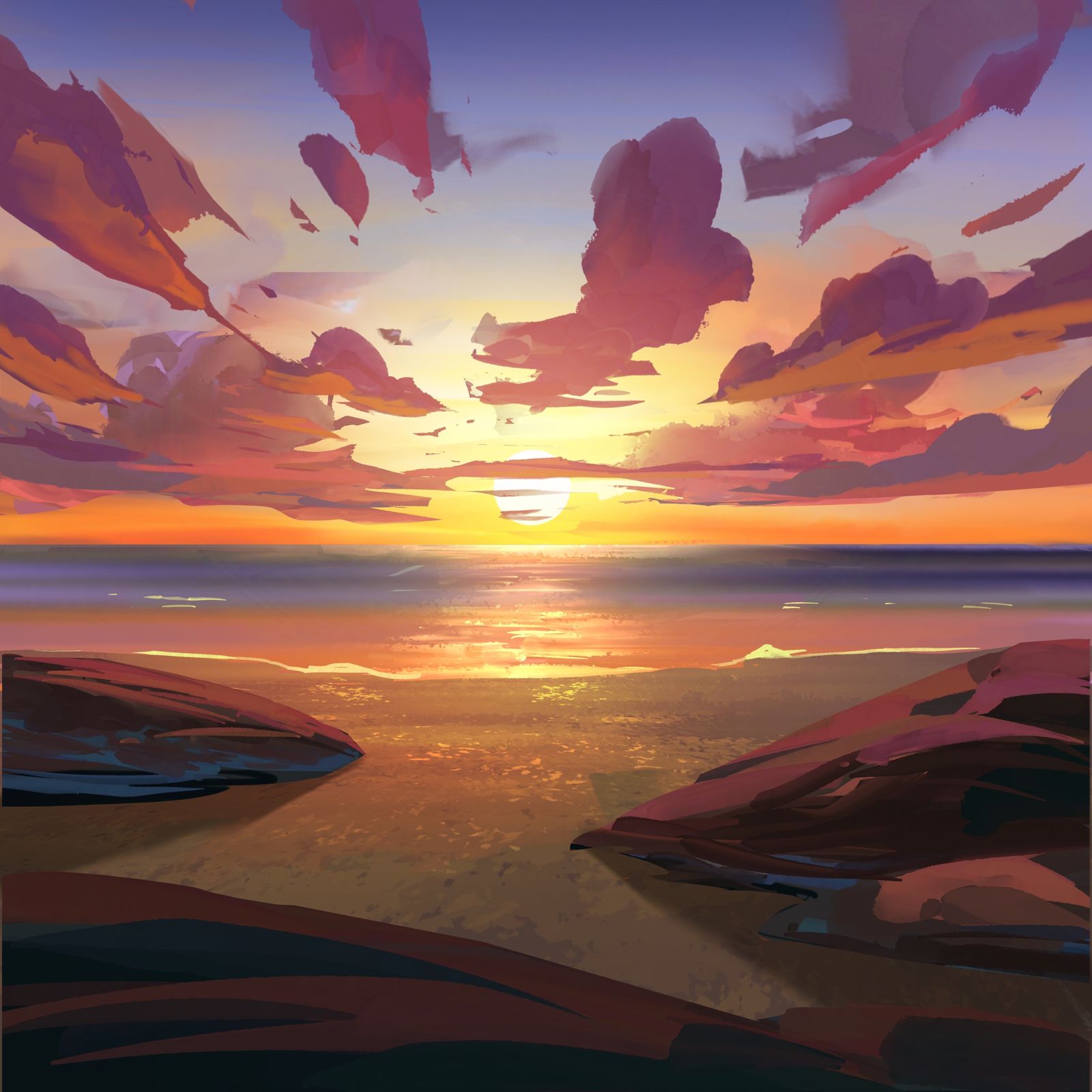
Developed by Mother and created by Golden Wolf through Stink, the fantastical music video takes inspiration from Disney and Japanese animations, illustrating British singer-songwriter Craig David, who wrote the song, as he takes a transformative train journey through breathtaking painterly landscapes.
We got together with Ingi Erlingsson, Founder and ECD, and Ewen Stenhouse, Creative Director at Golden Wolf, who talked us through the processes, challenges and victories of working on an animated project of this magnitude.
Credits
powered by- Agency Mother/London
- Production Company Stink/UK
- Director Golden Wolf
-
-
Unlock full credits and more with a Source + shots membership.
Credits
powered by- Agency Mother/London
- Production Company Stink/UK
- Director Golden Wolf
- Animation Golden Wolf
- Executive Producer Jeremy Smith
- Executive Creative Director Ingi Erlingsson
- Managing Director Dotti Sinnott
- Executive Producer Tan Jones
- Creative Director Ewen Stenhouse
- Producer Larissa Miranda
Can you talk us through how the concept for the project developed?
When Mother, the agency who came up with the idea, approached us, it was actually a very loose brief. We knew that Craig was on board, and that it had to feature some beautiful shots of the world, it needed to revolve around a train and have a strong ecological message.
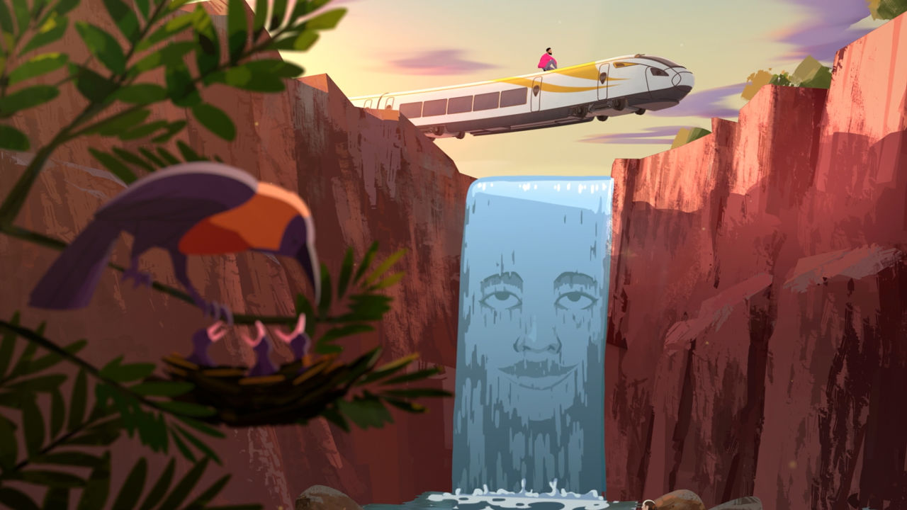
He feels like he's being led somewhere, by some unseen hand.
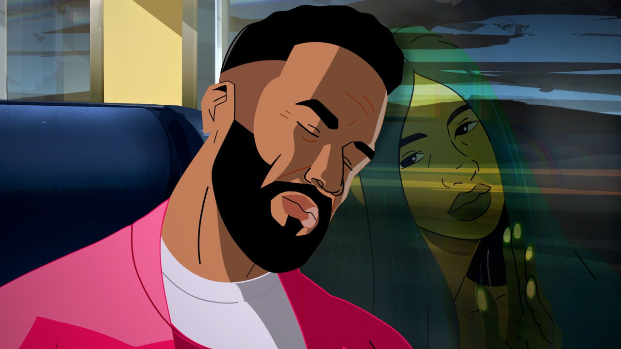
Beyond that, it was really open. So we started with a script, which involved a bit of back and forth with Mother, figuring out a way to tell the story using Craig as a conduit. Craig acted as our spokesperson, he has this conversation with Mother Earth, who features as a literal character in this as well as the metaphorical character.
In the story, Craig clocks that there's a woman slowly revealing herself to him - that’s Mother Earth. It’s almost like a love story, right?
We all know Craig for his more seductive brand of r&b, so there was an initial concept here that you might start off thinking the film is a love story to do with a specific woman. But it turns out, that's actually Mother Earth, and she's trying to gently guide him to get on this train.
We tried to push things and skew them a little bit here and there, to heighten that sense of surreality.
He sees her a few times as he's making his way through the city; he sees her on the billboard, then she appears behind a train and a platform - he doesn’t actually spot her here, but we do. So there's a lot of these missed opportunities, where he thinks he's seen her, but he's not quite sure. He feels like he's being led somewhere, by some unseen hand.


Access the world's largest advertising database. With an intuitive toolset that helps you explore, present and collaborate more effectively.
Learn More
And the style, the beautiful painterly colours, what was the inspiration for this?
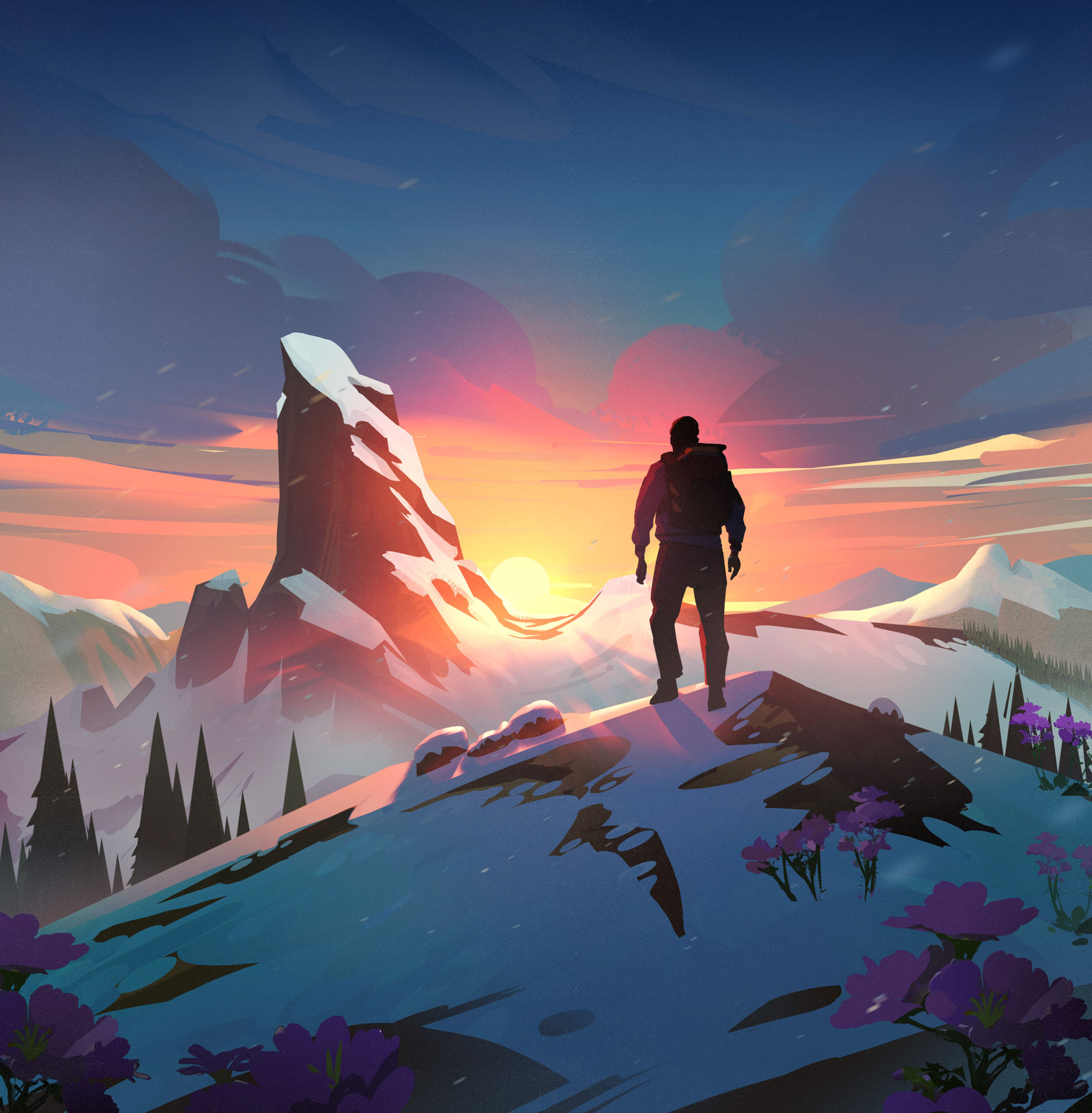
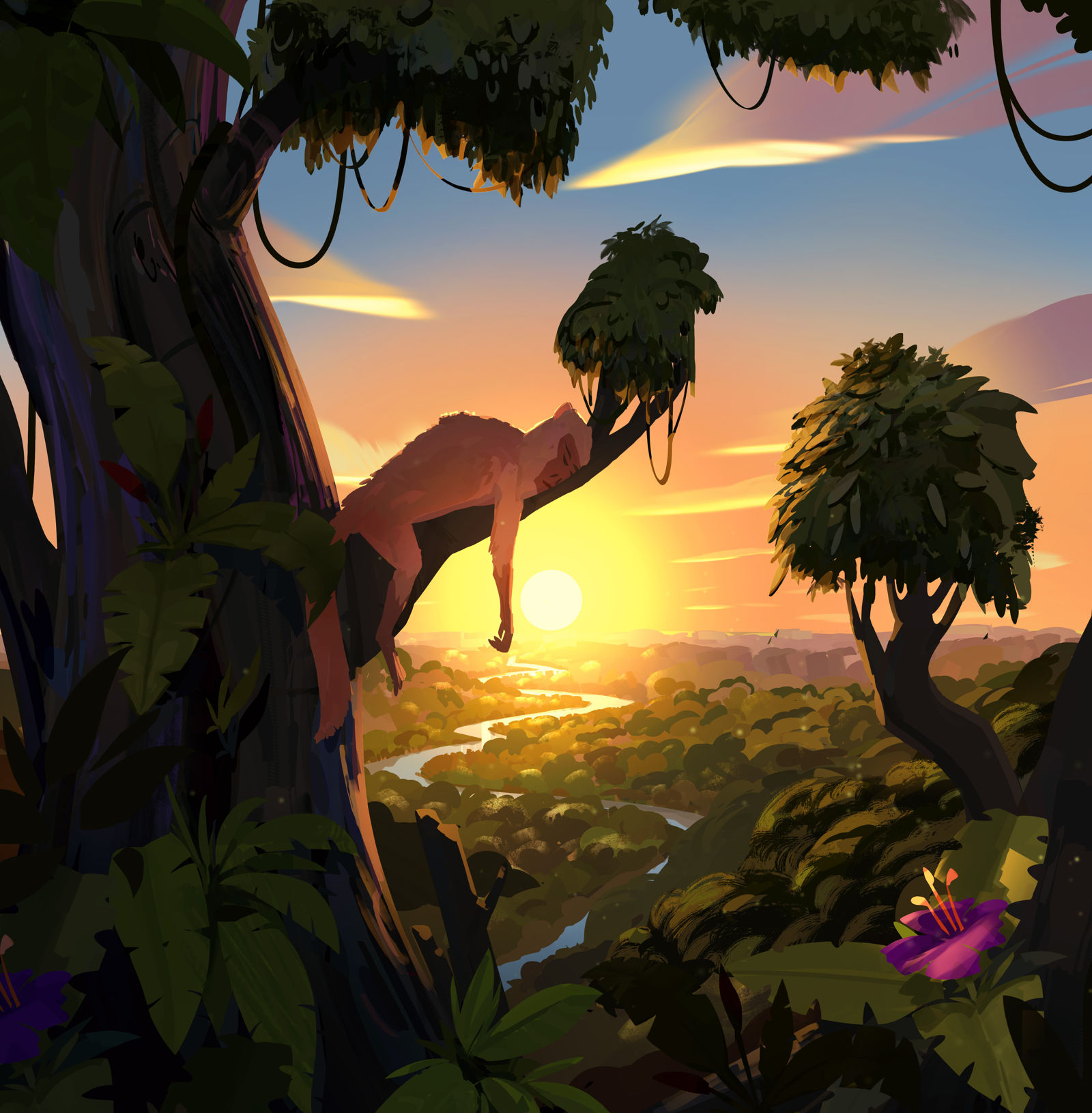
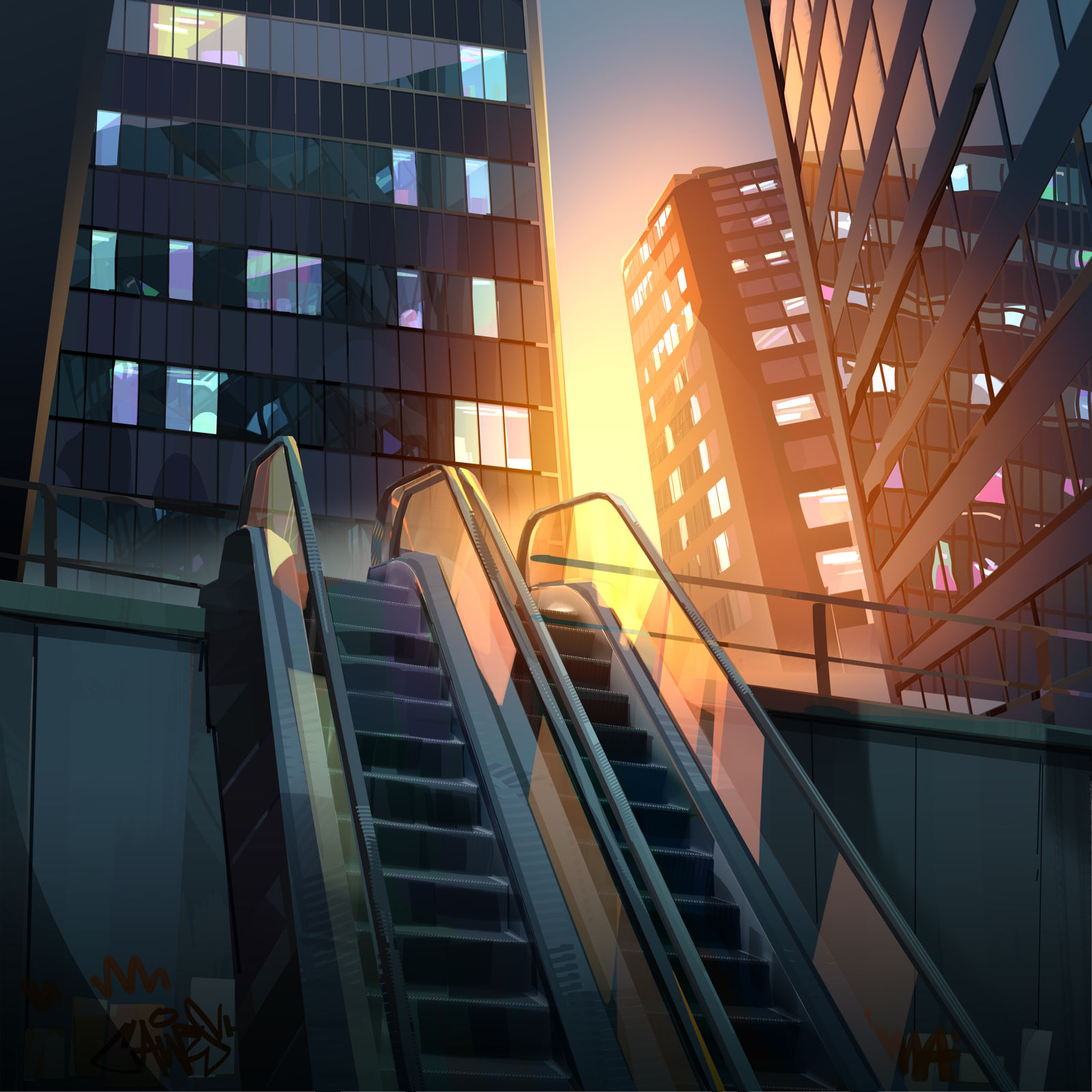
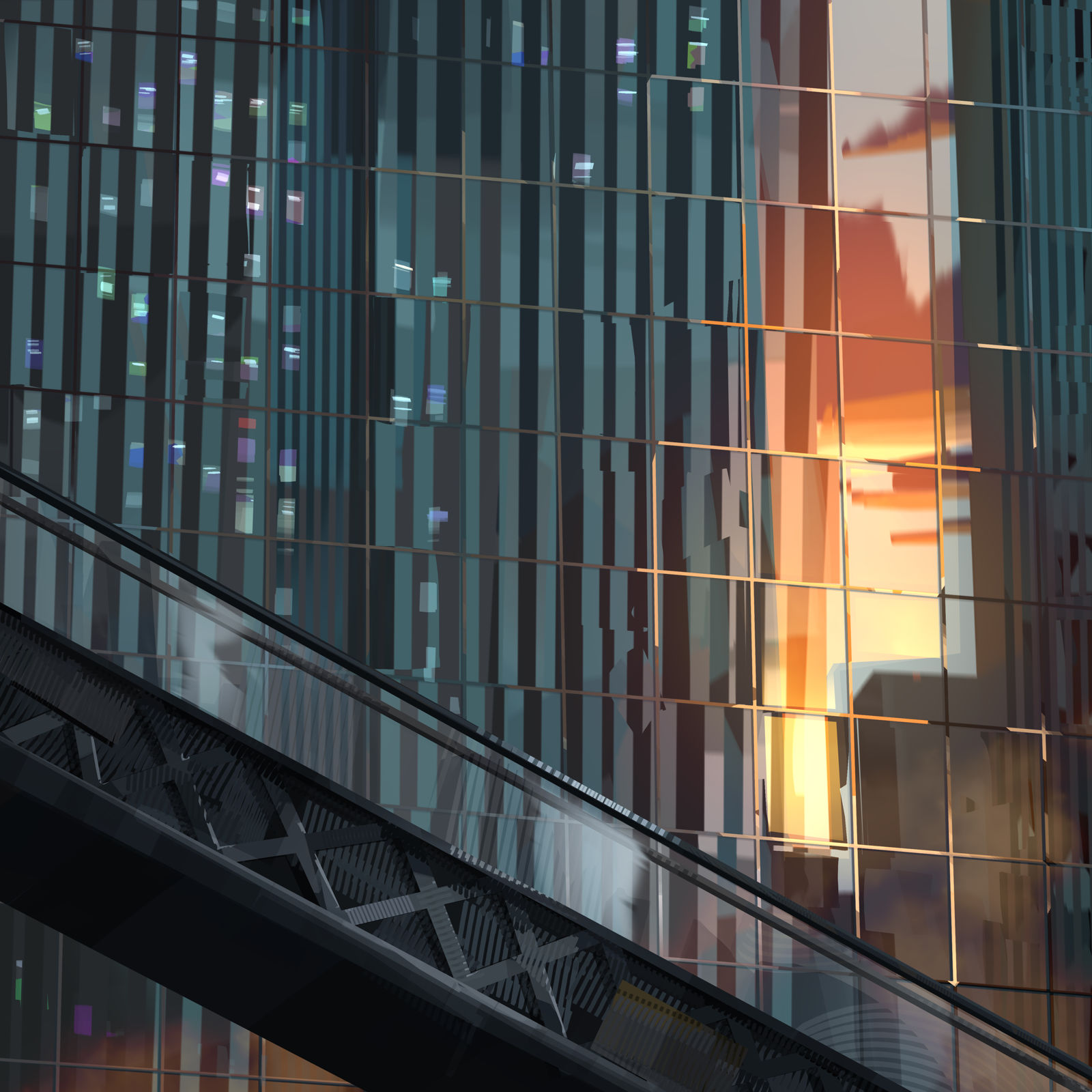
Our main starting point was actually Ghibli films, mainly because they have a way of showing nature in the most beautiful, vibrant way. But we didn't want it to simply be a copy of what Ghibli does. So we landed on this slightly more painterly, but graphic style. In particular, in the city, there aren't really any sharp angles or straight lines.
We tried to push things and skew them a little bit here and there, to heighten that sense of surreality. We're big fans of the Ghibli films, but we’re always very conscious that we don't want to copy what they do, because they are the best at it. But this is kind of our slightly more graphic, painterly interpretation of that.
We wanted it to feel like he was surrounded by these playful beings that have the ability to transform into animals.
There’s a lovely motif running through the film of painterly lines that look like ribbons, can you tell us more about this design choice?
The choruses do share those kinds of sentient lines. They were meant to help illustrate an otherworldly, uplifting moment, because that's when Craig Stuart sings about better days. That's obviously such an abstract concept to depict, better days means different things to everyone, but we wanted it to feel like he was surrounded by these playful beings that have the ability to transform into animals.
And the significance of these animals in the chorus is that they are all endangered animals that would be first on the list to disappear if we don't manage to get a handle on climate change.
How long did it take to produce and how many animators did you work with?
I think it worked out to be about 100 people that worked on the animation, it's a big crew. And we got the brief around the beginning of August.
Whenever you work on an animation that features a real person, you have to pay much closer attention to the detail in the character.
Did you have access to the lyrics before you planned the animation? How did you work with it?
Yeah, we had a slightly different version of the song when we got it, but it was pretty similar. When developing the film script, you have to ask, how does this interpret the highs and lows and the emotions of the song? Does it accurately match what he's talking about and the stage of the song that it's in? I think that's why the sections are so different, some of them are really positive and some are quite dark.
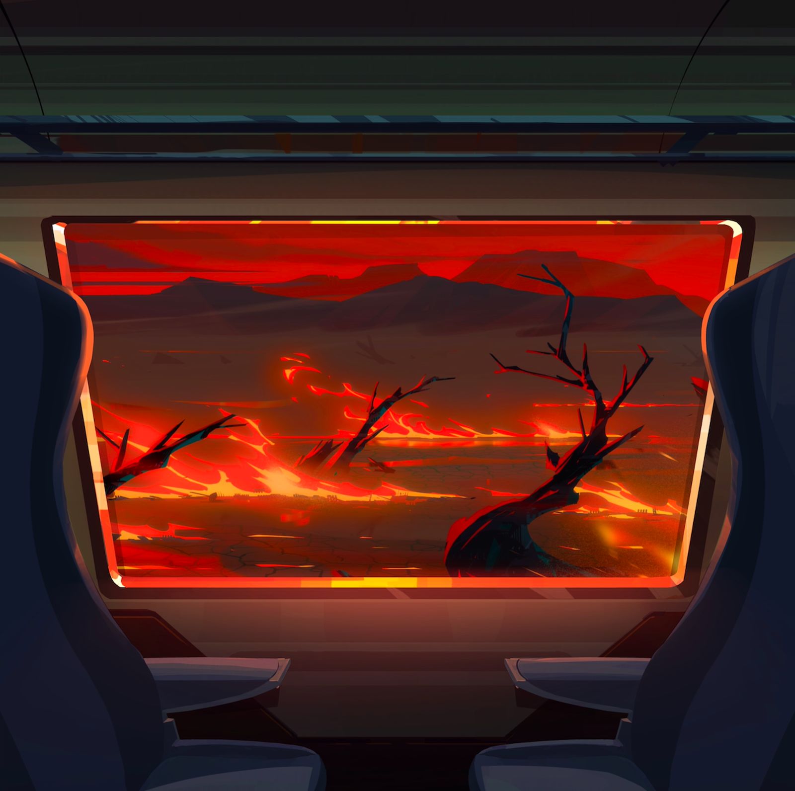
That's how we approached the script. Act one was our introduction to Craig, and Craig's introduction to Mother Earth. The second act was really just showing you about what's happening in the world now.
Act three is a more hopeful vision of the future. So it's slightly futuristic. If you look at some of the cities we've depicted, they're depicted more like futuristic eco cities, using Singapore as an example.

What were the major challenges that you faced?
There are always challenges with this kind of project, not least of which is the sheer scale of a spot like this, it's a lot of animation to cover in a relatively short amount of time.
We also had such a big crew , we had to manage people who are working globally, with in-house staff, as well as freelancers. It was a very global production, which in a way matches the global nature of the film.
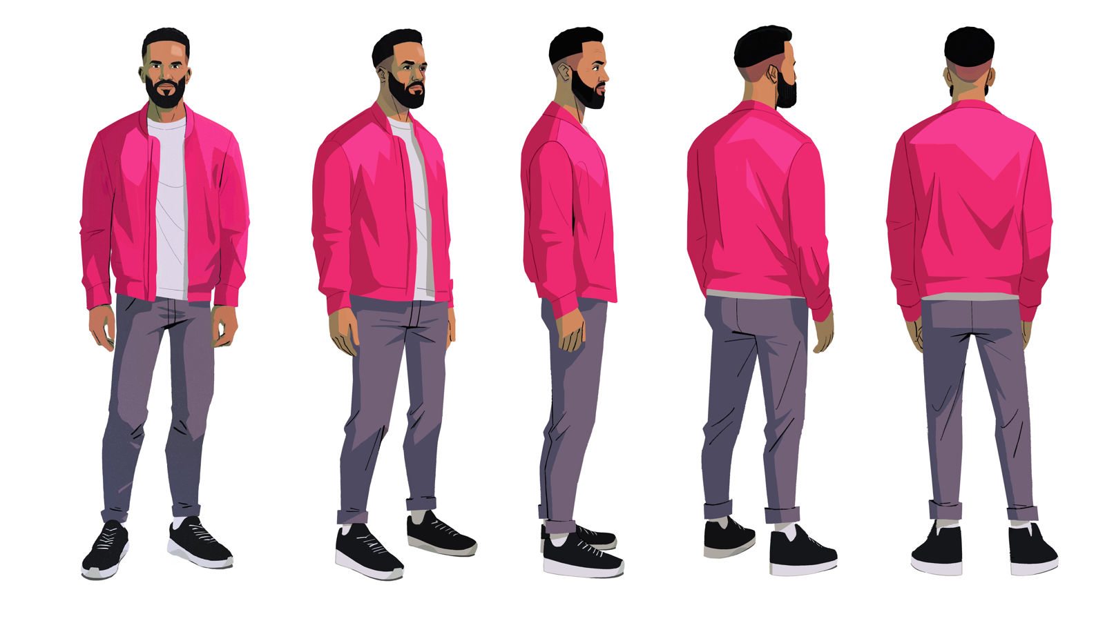
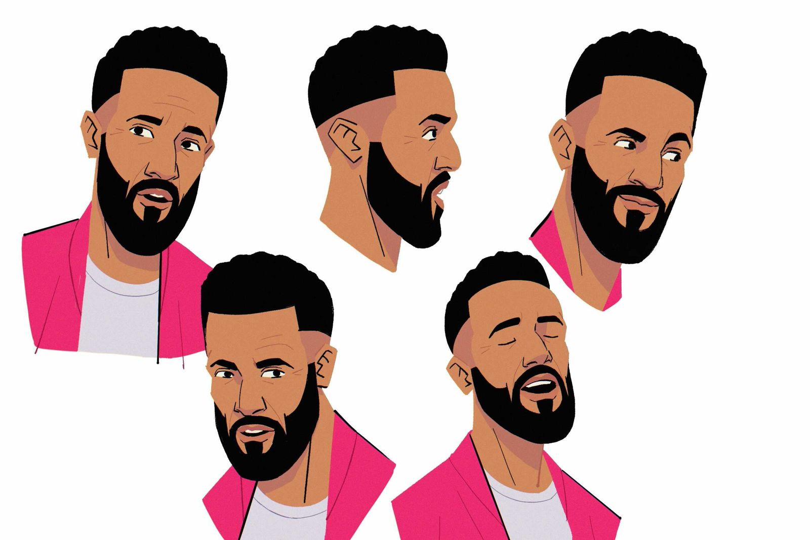
Craig got an early glimpse at our design of him, he was quite impressed that we hadn't shied away from giving him creases and wrinkles on his face.
Also, whenever you work on an animation that features a real person, you have to pay much closer attention to the detail in the character than you would if it was an imaginary character. That’s some of the biggest challenges, but all worth it in the end.
Was Craig happy with how you visualised him?
Yeah, he was actually. Craig got an early glimpse at our design of him, he was quite impressed that we hadn't shied away from giving him creases and wrinkles on his face.
He's very aware that we could just make him look like a much younger kind of heroic version of himself. But there was just a slight element of realism in the design that we wanted to introduce and Craig was a fan.
It was important to not just design a pretty woman.
How did you come up with the character design for Mother Earth? What were you influenced by?
It was a combination of Mother Earth in Fantasia, a much more fantastical version of Mother Earth, and Te Fiti in Moana, where she's depicted as this giant green woman who's kind of shrouded in greenery, although that was a bit too literally connected to nature for us.
We wanted to find something that had a human touch to it, but was trying to make her motherly and not just a beautiful character.
It was important to not just design a pretty woman, but to actually create something that feels otherworldly.