Smuggler's Neil Harris Give Movie Cliches The Fizz Of Berocca
Taking on age-old genre-movie tropes, Smuggler's awesome idents for Berocca manage belly-laughs in 5-second bursts. We chatted to filmmaker Neil Harris about the concept, the shoot and how he gave the films their particular look.
Creating five-second spots to bookend the ad-breaks of TV shows and films can be a blessing and a curse – your work is most likely to be spotted, but the chance of annoying viewers is pretty darn high. So imagine our delight when the latest bumpers for Berocca stumbled into our inbox from the clever folk at Smuggler.
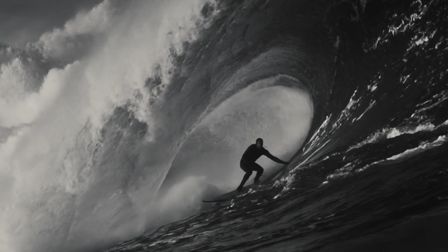
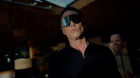
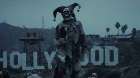
Taking on age-old genre-movie tropes, the idents manage the unlikely feat of making a one-joke skit genuinely funny. Key to the success of the spots is the sublime performance direction by Neil Harris and the incredible work of the productions art dept – applying a hyper-styled authenticity to the proceedings that make them a delight to watch.
We managed to suppress our chuckles for long enough to chat to Neil about the concept, the shoot and how he gave the films their particular look.
How did you get involved in the Berocca campaign?
The scripts came through from Naz and Rob at JWT. I'd met them before and I was impressed with their tenacity and their single-mindedness to make this stand out. They'd obviously put a lot of thought and effort into this campaign and wanted it to look amazing. They had a very determined view to make these look as authentic as possible from the costume, set design and casting which is an amazing starting point for a project like this.
Where did the movie concepts come from? Did you have an input, or did the agency control the genres chosen?
The agency had already defined the genres, although I was able to flesh out the details: assigning each one a distinctive era and then establishing an appropriate look from very specific references. We watched a lot of awful films.
How detailed was the pre-production art direction for the films? The attention to detail is magnificent for such short screen-time?
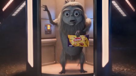
Once we'd got the look of each, it was up to our Production Designer Sarah Kane, and her Art Director Tom Read, to come up with cost-effective yet very creative solutions to an immensely challenging brief. They and the rest of their team worked wonders, building props from scratch in many instances, and creating a whole alien landscape in miniature. Natalie, our costume designer, was phenomenal in producing such detailed Space Suit designs.
How was the shoot? Was it split over many days, or did you have studios built back-to-back?
It was achieved in no small part due to my producer, Jason. Without him we wouldn't have been able to work out all the logistics on such a tight budget.
We shot three spots in a mansion near Watford two in the house and one in the woods at night. It was literally a case of shoot then run along to the next. The remainder were all partial sets constructed on a stage. We'd finish one and build the next during breaks in the day. Again a genius bit of Art Dept/First AD collaboration...
How did you direct your performers/crew? Did you have any specific reference points for the films (we're guessing Nosferatu, Star Trek, etc… The Monster Squad?)
The genres all have their own performance styles that help define them. As a whole they're all larger than life, everyone is caught up in the drama of their particular situation. It's unusual asking an actor to try a bigger performance on the next take, we're normally trying to dial it down. Monster Squad? I wish I'd had you doing research for me in pre-production!
Sci-fi, horror, action, adventure – did you have a favourite genre to work on?
I love the Sci-Fi spot for its art direction but also for how lame the idea is. The actor was really funny but couldn't hear anything through the helmet and air pump.
How complex was the post-production on the ads? The grading in particular must have been important to get spot-on.
Framestore worked SO hard on this they are amazingly diligent and work quickly and intelligently. The Sci-Fi spot as well as the Bomb and Pirate are all down to them. Without their crafting of the backgrounds particularly we'd have been lost. Laura (Producer), Steph (Flame) and Steffan (Grading) worked all hours in the week - they had to have an unbelievable effort to complete the project. Steffan was grading and re-grading all the time coming up with new ideas and ways in which we could realistically degrade the film looks.
Have you got any more genres in the locker? Can we expect more films in the series?
You'll have to ask Naz and Rob there are still plenty of films to ape...
The ads straddle films on Channel 5. Is there a particular skill involved in creating 'bumpers' like these? Is brevity a difficult thing to achieve in comedy?
I think it's one of the reasons they're so effective. We tried a longer cut of each for showreels but they didn't get any better. Their joy is in the fact they're so brief and throwaway. We spent ages distilling the idea down to its essentials and concentrating on those 3 or 4 shots we didn't have any spare footage but I'd like to think we squeezed the most out what we did shoot...
What's up next for you?
Shooting a great campaign for McDonald's with the lovely folks at Leo Burnett. Then off on holiday.


 Membership


