What’s your #MotionType?
Sean Koriakin, Creative Director at Watts Media, kicks off this month's Social Media Focus with some tips on how to make sure typography cuts through on the transition from broadcast to pocket screens.
)


It’s rare for a broadcast commercial to make the leap to social without serious alterations.
What looks great on TV can look like a cluttered mess on Instagram. From a technical point of view, there are extremes in real estate to work with – you’re not usually locked into thinking in a 16x9 aspect ratio like you would for TV. As advertisers debate what makes the biggest impact on social media, the fundamentals of type and motion design can be the powerful hook needed to get an idea across in a landscape overwhelmed with competing messaging.
What looks great on TV can look like a cluttered mess on Instagram.
A less-is-more approach typically wins the day – think simple, clever, typographic animations – and as a result, the art of typography design is enjoying a bit of a renaissance.
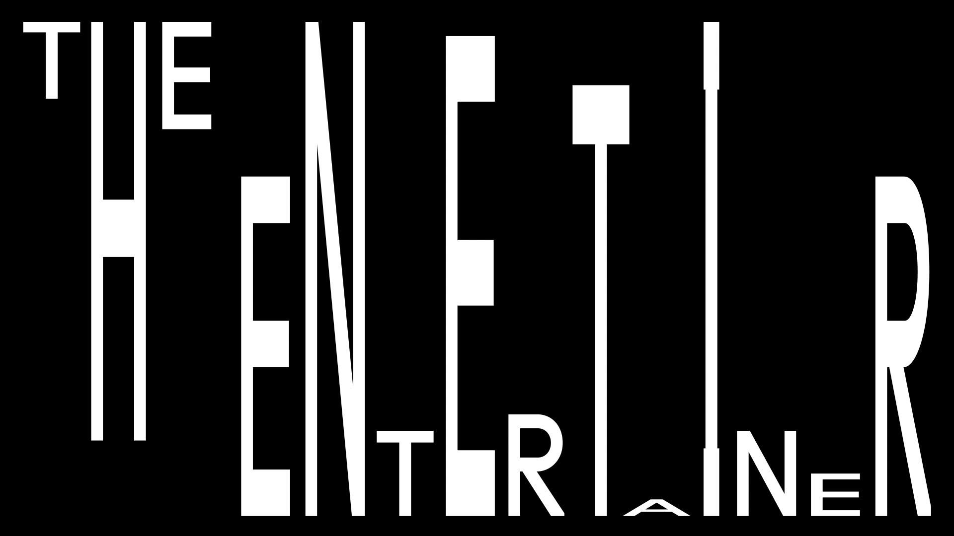
When Type Is Right
How do you know when a type-driven approach makes sense? When type is already the focal point of a larger campaign, embrace and deconstruct it into short ads. This is especially true when you strive for quick brand awareness. Strong Sans-Serif typefaces make the easiest quick reads. Color is also critical and can go from both extremes.
While bright, multi-colored backgrounds jump, also consider muted palettes to allow the type to cleanly and elegantly present the message.

Credits
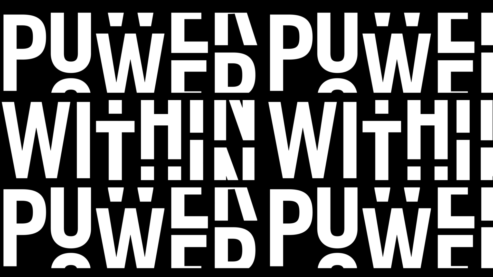
powered byAbove: Verizon’s 5G Network launch.
Verizon’s 5G Network launch is easy to read on the small screen and has immediate brand recognition. The font, colors, and layout closely follow brand guidelines while making use of punchy kinetic typography blended with 3D animation.
By stripping down everything but the message itself, you can elicit an emotional response.
Visa’s Money is Changing campaign examines everything from dating norms and marriage to salary disclosures and the pay gap. It pops on social with simple type layouts, a bold retro color palette, and personal touch.
Keep It Simple
Attention spans on social media can come down to a matter of seconds. Try not to burden the viewer with extra frills. By stripping down everything but the message itself, you can elicit an emotional response.


Above: Airbnb and Stance's clever text.
Airbnb has done this effectively with a series of type-only ads that play Mad Libs with your life, property, and finances. Using a simple slot-machine animation, it stands out as a fun and playful way to show the story of being an Airbnb host. It also lets you focus on the emotional element of what it can actually mean to you.
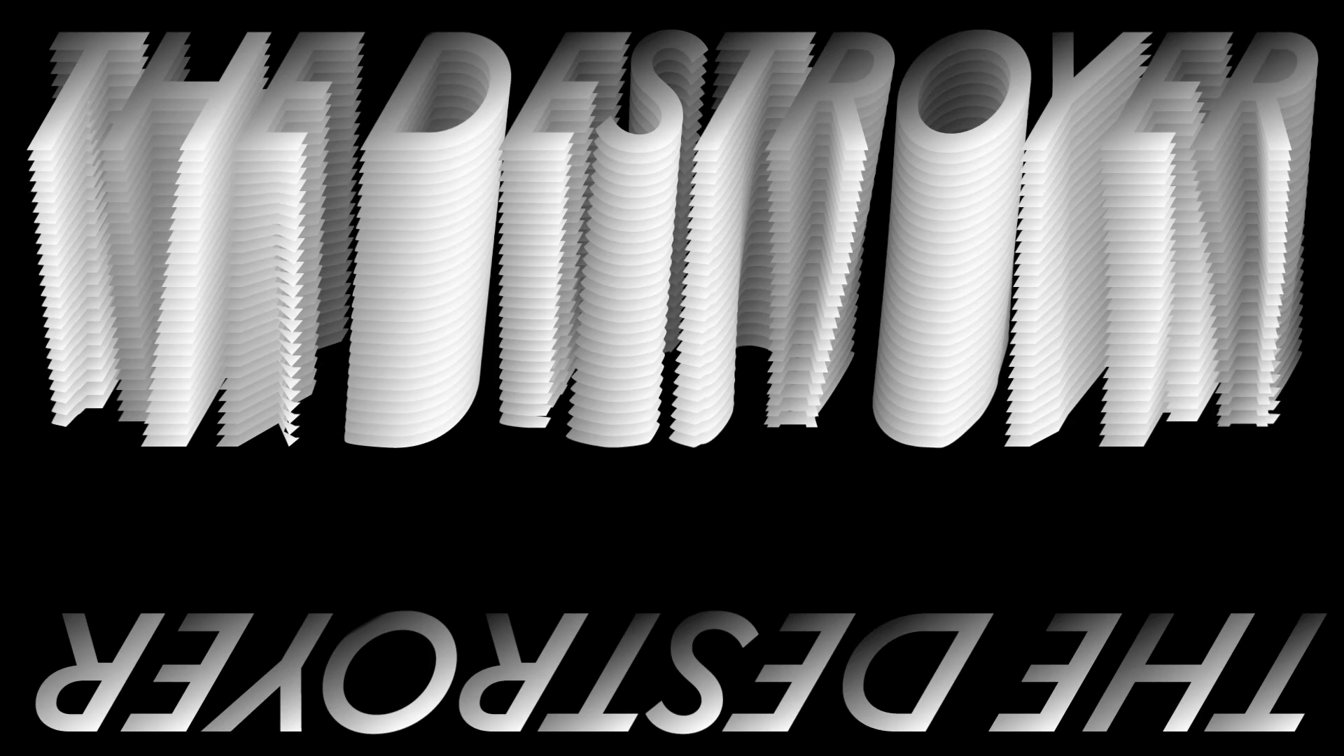
Kinetic type animations can be the best attention grabbers.
Stance’s bright and colorful series of ads present the product against prominent and playful type animations that take on the character of its clothing. Have fun manipulating the typeface itself with simple metaphoric animations.
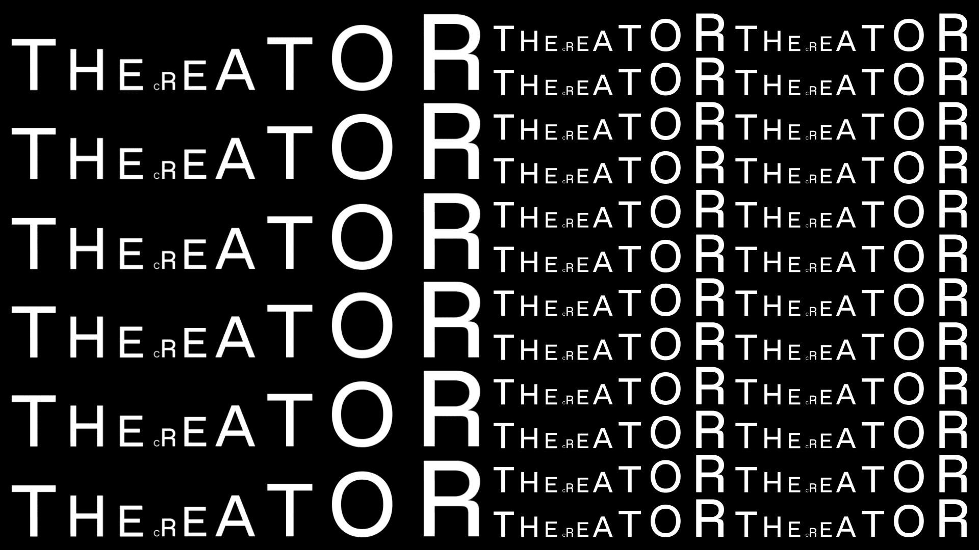
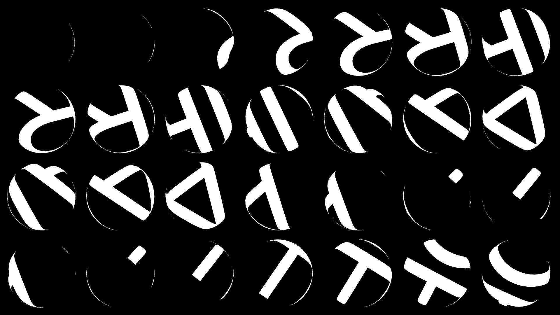
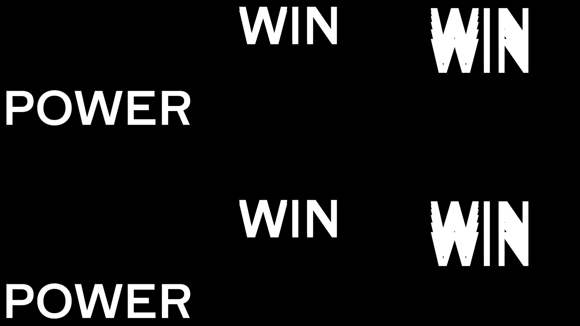
Make It Move
Kinetic type animations can be the best attention grabbers. Set the tone and bring a sense of artistry by pushing the limits of what the type-form can do with energy and movement. This can be accomplished with different techniques, such as animating whole words into place or playing with the structure of the letterform. The fonts themselves can also be used as a dynamic container for the action.


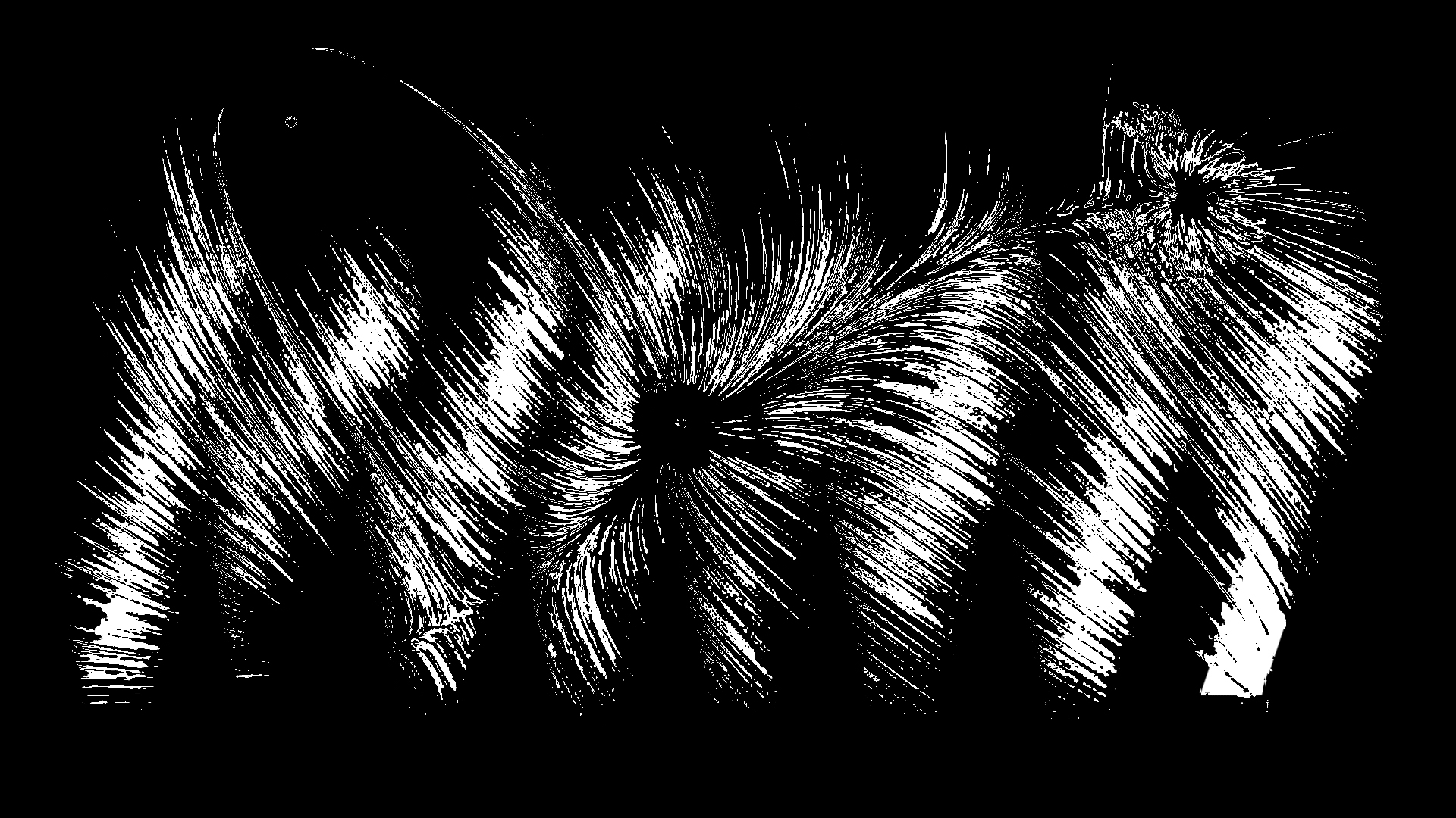
Above: DIA Studio's Nike Basketball illustrations.
DIA Studio created an amazing black-and-white series of looping type animations for Nike Basketball. With a simple, stark type, it’s hypnotic and eye-catching.
Fonts can be used as a dynamic container for action.
Red Bull Radio is a web-based radio station offering eclectic programming, interviews, and music. This bold type animation made the announcement for the 'Peak Time' radio show. Lots of upbeat dynamism and very on-brand for a show that featured lively interviews with the artists and tastemakers pushing culture forward. With abrupt action and sparse compositions, it accomplishes a retro-print-meets-stop-motion effect that is a perfect vehicle for its content.

Credits
powered byThis animated social series for Nike’s 270 and VaporMax shoes [above] pushes letterform weights in amazing and unexpected ways. When the type is used alone, it tells a powerful story about movement. When it’s integrated with photography, the flowing structure of the typeface becomes part of the story itself.
Beats by Dre brings us BeatsX with strong kinetic type over footage that’s bright, colorful, and memorable. Even with sound off, the feeling of movement and music is conveyed at a glance.
A type-driven approach to your social strategy can be very effective at driving brand awareness, engagement, and shareability
As seen in all of these examples, a type-driven approach to your social strategy can be very effective at driving brand awareness, engagement, and shareability.
For us designers, this presents a real opportunity -- and open playground -- to explore fresh approaches unhindered by the expectations of more traditional ad campaigns.

