Too punny for words
From the Economist's classic print ads to Domino’s cheesy pun-generating bot, Tim Cumming explores the weird and wonderful world of wordplay in advertising.
Is the pun an art, or an affliction? Depends who you’re doing it do, we guess. But can you resist making one, however lame, if the opportunity presents itself, popping into your head like Kilroy Was Here with a knock-knock joke? What, you again?
For some, pun-related wordplay is a crime on a par with flopping out your soft parts on public transport. For others, the knock-knock joke, the core of puncraft, is, like herpes, the gift that keeps on giving.
Often derided as occupying the lowest class of humour, as well as being the most excruciating part of any Shakespeare comedy, the phenomenon of one word sounding like another, and meaning something else to boot, is a memorable and powerful communication tool, at least in expert hands, a little Tardis of double meanings, double entendres and double takes. If you’re looking for a quicker method of drilling a message through a one-second window of attention into people’s hearts and minds, good luck.
[Management Trainee] was like nothing else. No logo. No product shot. No end-line. No image. Just an incredible amount of bright red ink.
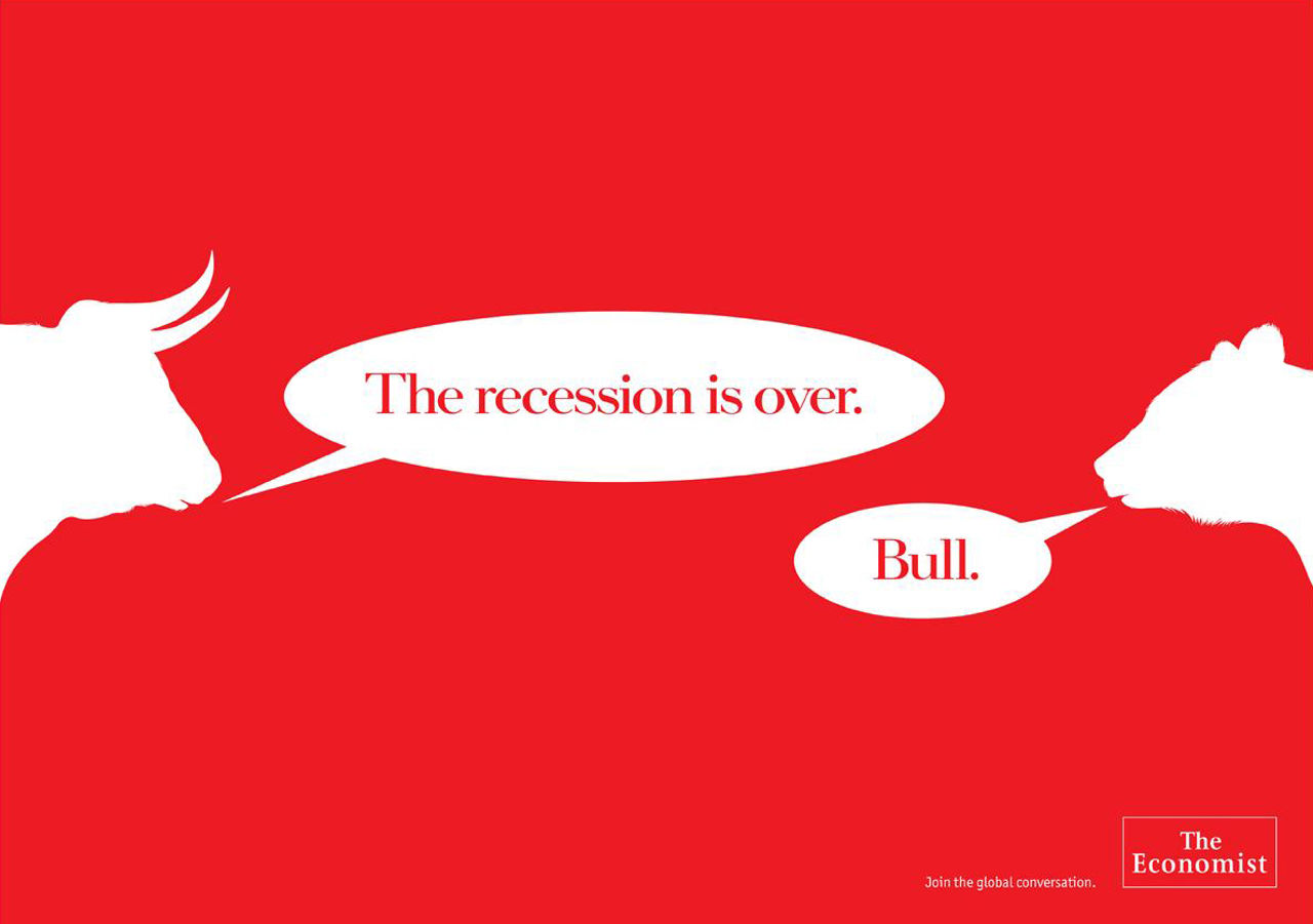
With the English language being as voluminous as it is – a titanic gourmand devouring more words and ways of saying things than pretty well any other global tongue – puns and wordplay are an essential part of its daily diet. Double meanings are its dressing up box. In the urban environment, you’re never more than a few feet away from persuasive wordplay, but some of the best, and most iconic lies in the 20-year-and-counting lifespan of The Economist campaign, the brainchild of David Abbott at AMV BBDO at the end of the 1980s.
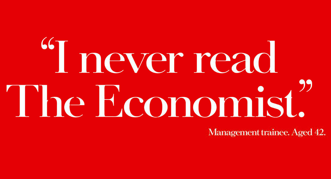
Dave Dye worked as creative director on the campaign a decade into its long and lustrous life. He recalls the impact of the very first execution, Management Trainee. “It was like nothing else. No logo. No product shot. No end-line. No image. Just an incredible amount of bright red ink. And the quote; someone throwing shade on the product, was almost confusing. But like in Mission Impossible, it would detonate four and a half seconds after reading - just as your brow began to knit. It was very radical – despite being created by two fifty-somethings wearing tweed."
There is, clearly, a class system when it comes to puns. “No time Toulouse” for UPS or “shirtin’ with danger” for H.I.S shirts are vintage examples to generate low mirth.
Copywriter-turned-creative-mentor, Mike Nicholson, was at AMV from 1996 through to 2014, and worked the words on a range of Economist campaigns, starting off with 2002’s Cures Itchy Scalps. Nicholson unpacks the imagery and the wordplay. “I liked the idea that people would scratch their heads if they were confused, and reading The Economist would stop that. It was also referencing Head and Shoulders' anti-dandruff shampoo, and being 'head and shoulders' above the rest.”
Like many a copywriter, Nicholson had the ‘no-puns on any account' mantra drummed in to him as a matter of course. But when it came to The Economist, those rules were there to be bent – and bent double by its genius creator, David Abbott. “All the art colleges say you shouldn’t use puns,” says Nicholson. “It’s a very lazy way of getting a gag into a headline. However, with The Economist campaign, David Abbott crafted the wit and the tone right from the off. His character was very witty and that came through in the work.”
There is, clearly, a class system when it comes to puns. “No time Toulouse” for UPS or “shirtin’ with danger” for H.I.S shirts are vintage examples to generate low mirth. “A lazy pun, or a corny one, will make you wince,” says AMV BBDO’s Tim Riley, current creative partner and head of copy. “But one of the most powerful UK ads of all time was a pun.”
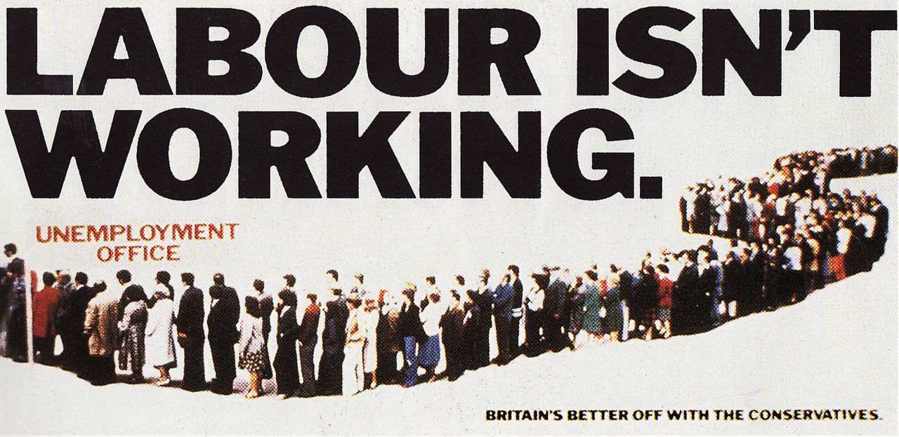
He points to the famous Labour Isn’t Working billboard from 1979, showing a long, winding queue of unemployed workers below the header, six months before the Conservatives swept to power. “That pun alone may not have been the deciding factor in the election, but it certainly seemed to crystallise what people thought was wrong with the government,” says Riley. “It was cited and discussed everywhere.”
Perhaps because of the sharpness, speed and brevity on which any successful visual or verbal pun depends, they are often resorted to in times of brand crisis. Take Burger King’s brilliant Flame grilled since 1954 from David Miami, which featured photos of actual restaurants that had gone up in flames (no one was hurt in these BK fires, no fowl play suspected) or the chicken-related cry of FCK from KFC after a serious chicken drought forced the brand to confront the hell of a chicken restaurant without chicken.
Hermeti Balarin, co-ECD and partner at Mother London, was the man juggling the letters. “We started playing with the three letters in the logo as a way to quickly communicate how sorry we were,” he says. “The first one that came to us was KF_ with a missing C symbolising the lack of chicken in the shops. But that didn’t feel strong enough so we carried on until we came up with FCK. Before FCK, we used to preach that all puns are bad, that we should leave them to Sun journalists. Maybe we need to reconsider...”

When puns do go bad, that’s usually the end of them. Groan, wince, move on, forget. You’re never going to see them again. Swipe left. Or, in the case of Dominos, right, and right again. Here’s Sophie Clark, associate creative director, VCCP Kin London, on the slice of inspiration that led to the idea of a lovetastic pun generator of cheesy chat-ups for Domino’s Pizza, Dom Juan.
“This was literally our dream brief. I've always believed the pun is mightier than the sword so we wrote hundreds of lines. Throughout the conversation with Dom Juan, you could get him to give you even cheesier lines, or ask him to dial up the romance with more doughmantic lines. So there was a real range we had to cover off. I think my favourite has to be ‘A pizza me wants a piece of you. Will it be love at first slice?’.”
Credits
powered by
- Agency VCCP
That’s a pun double-packed with double meanings and it’s right in Sophie’s ballpark. “Puns can be as divisive as pineapple on pizza,” she says, “but when they're super cheesy or tongue-in-cheek we thought most people would appreciate them, even if they made them cringe a bit. It's such a fine line between a pun being witty and a pun making you groan… And some puns can be so bad that they’re good.” Her own personal faves include a Nike rugby poster campaign bearing the headline ‘It’s the taking apart that counts’, and the eye-catching simplicity of Nando’s ‘Poultry In Motion’ on their delivery bikes.
Puns aim high, puns go low, but while it’s been an industry adage to pass them only to your colleague, not your boss, they are a basic part of communication’s armoury.
In the case of Knightsbridge store Harvey Nichols, you’d have thought their AAA-plus clientele would be above the common-or-garden draw of the pun. Don’t you believe it. Just ask adam&eveDDB's Henry Westcott and Eduardo Balestra, who conjured up the store’s Dead Rare campaign. What they were looking for, they reveal, is “the most inappropriately appropriate place to display a piece of very rare Harvey Nicks jewellery”. Cue the taxidermy animals. Rare ones. No one’s going to object to that … are they?
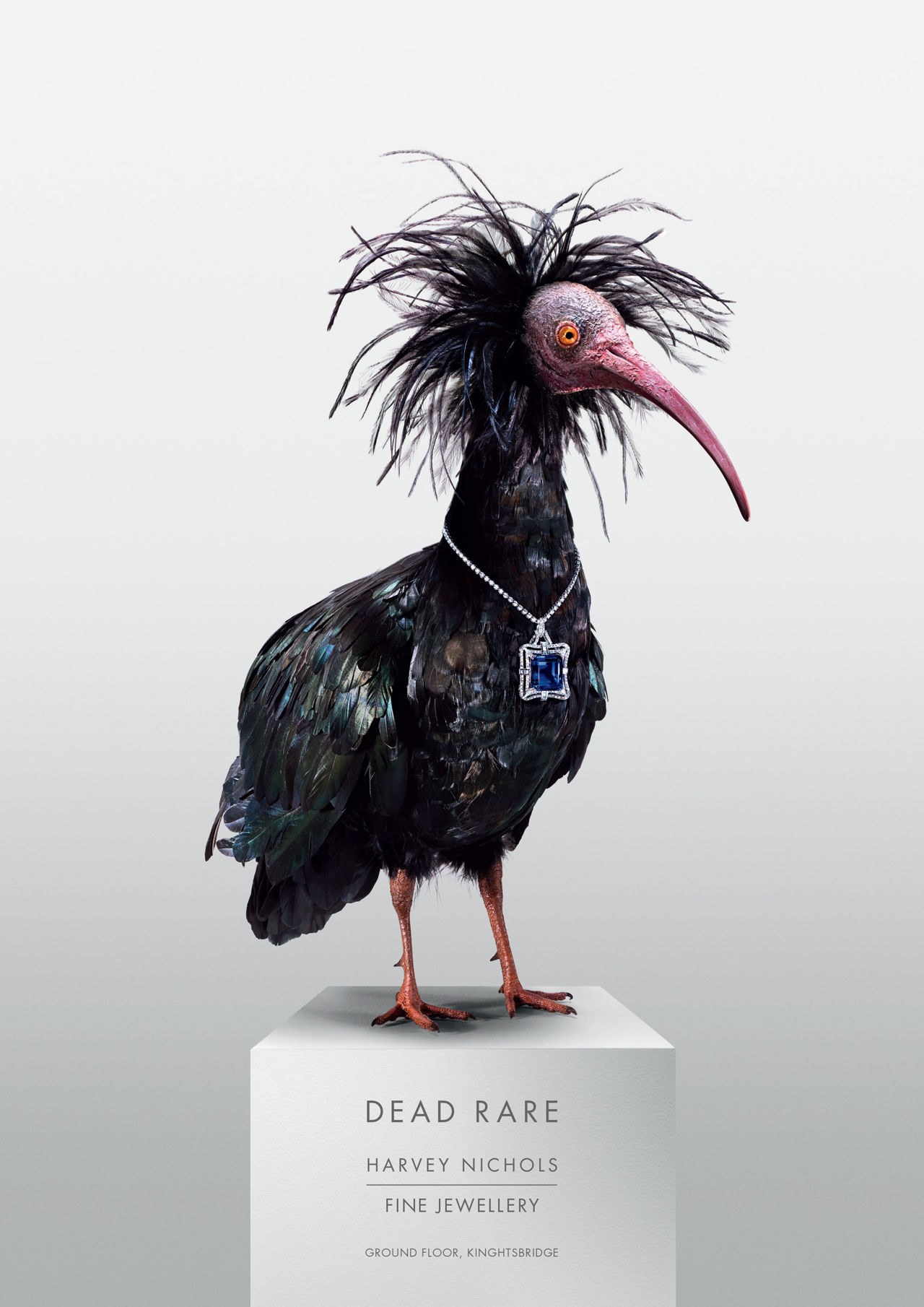
“We cycled through a lot of different stuffed animal options before we hit on the Northern Bald Ibis [the rarest bird in the Middle East], but we only settled on the end-line quite a time after we had the visual side sorted. We never intended it to be based on a pun and toyed with other options before finding 'Dead Rare' suited the ad best – for obvious reasons.”
Like Burger King’s flame-grilled poster campaign, Dead Rare combines the verbal and visual in one perfectly realised koan of creativity. “If done well, it can be a disarming way of demonstrating something about the product. One that springs to mind is a billboard from the long-dead airline PanAm. It simply had ‘Sydney’ written upside down. You can’t argue with how quickly it communicates.”
Nor would you want to get in the way of Just Eat’s long-running campaign on the London Underground -with lines like ‘Gimme, gimme, gimme a naan after midnight’ and ‘Man, I feel like a wonton’. “Which skirts the edge of decency,” say Westcott, “but, at least in our opinion, are kind of endearingly spot-on for their market. There was also the Cockburn’s Pronounce Responsibly campaign, that was quite funny and educational too.”
Above: Burger King's award-winning 'Flame grilled since 1954' poster campaign
Puns aim high, puns go low, but while it’s been an industry adage to pass them only to your colleague, not your boss (for Dye they are a "slappable offence", and his “least favourite form of advertising”) they are a basic part of communication’s armoury.
“No one can deny that good wordplay is disarming and memorable,” remarks Westcott, “and we’re sure that a good many creatives’ first-ever ads have included something punny. But it’s all about knowing which puns you slide over the desk to your partner and which ones you present to your boss. It’s up to creatives’ own in-built filter to know when a piece of work based on a pun leads to a shallow, uninspiring ad and when it can stand out as something special.”
The preponderance of poor-quality punning mitigates against such happy finishes, but they can and do happen. “This may lead some in the industry to believe that puns are an evil member of the family of options creatives can employ,” the duo conclude. “Which of course they aunt."
“Sorry. That was uncle.”
)


 + membership


